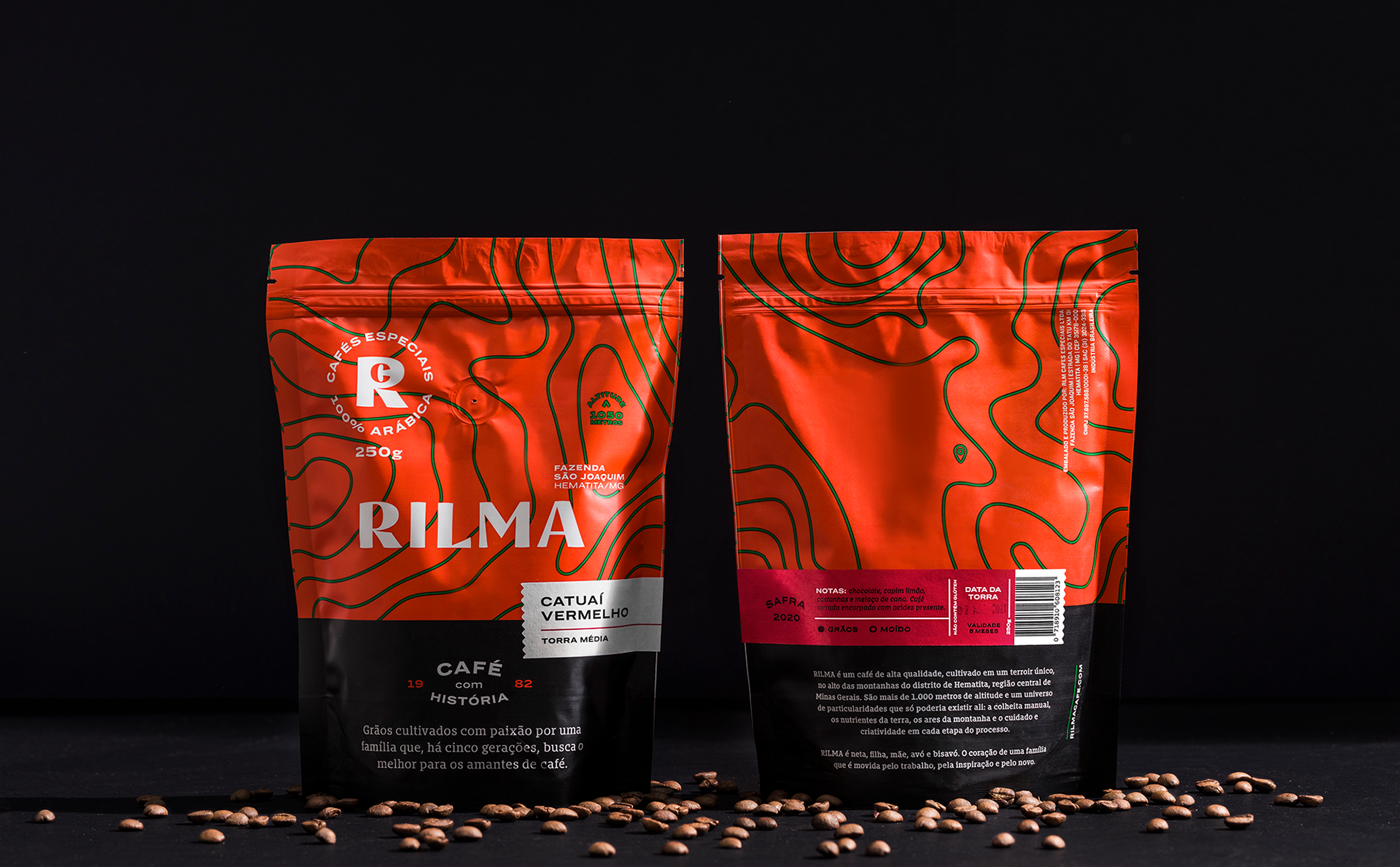
Grãos cultivados com paixão
por uma família que, há cinco gerações,
por uma família que, há cinco gerações,
busca o melhor para os amantes de café.
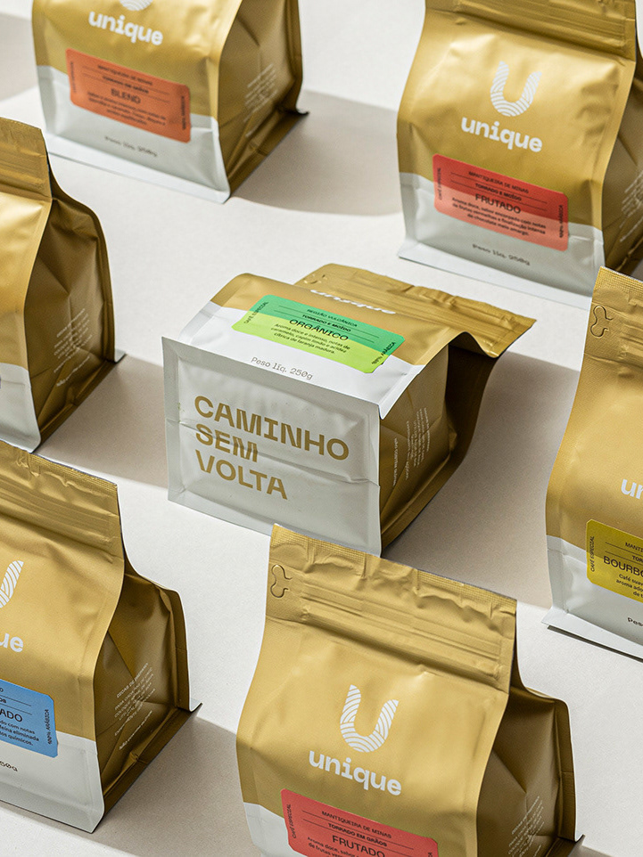
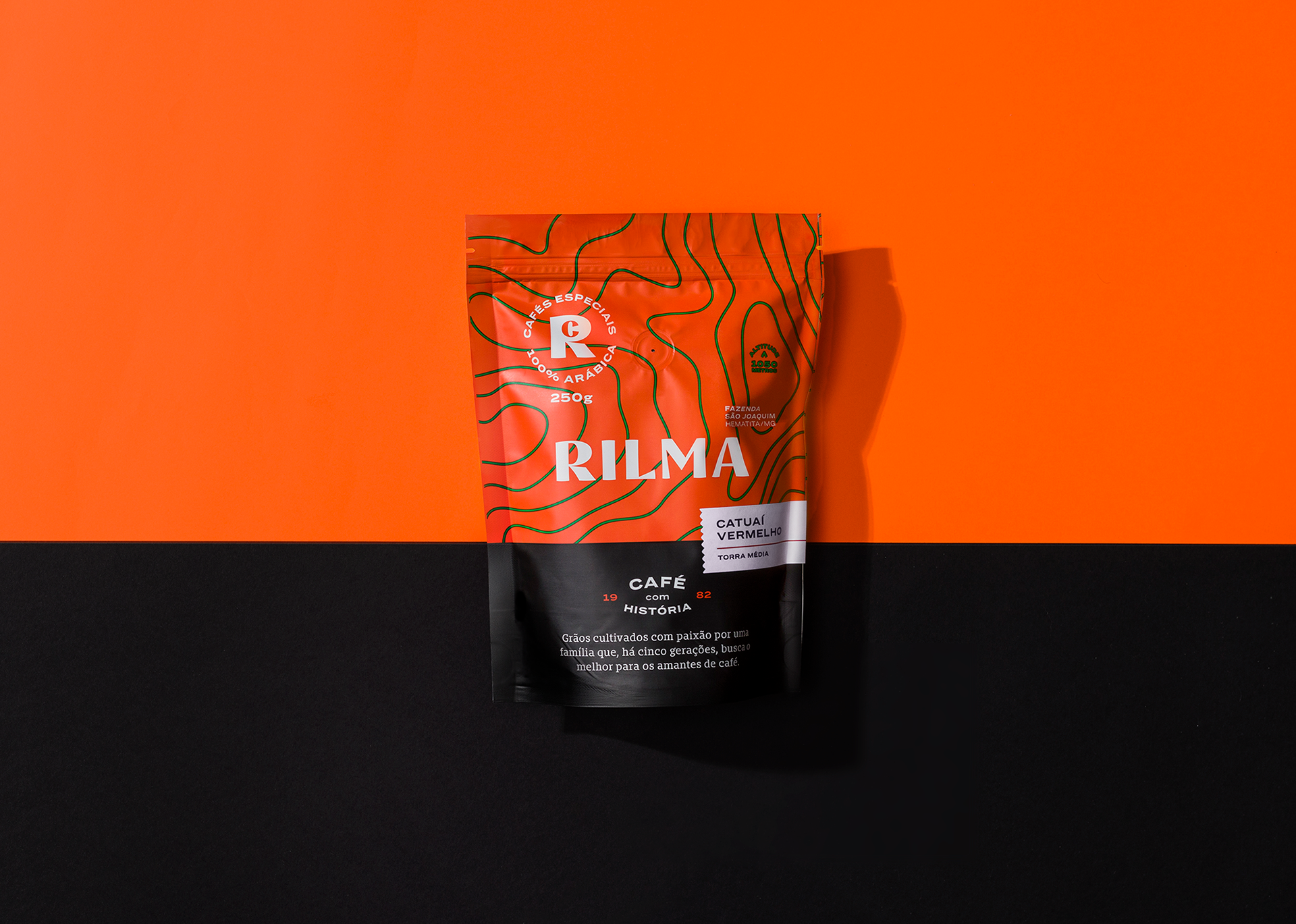
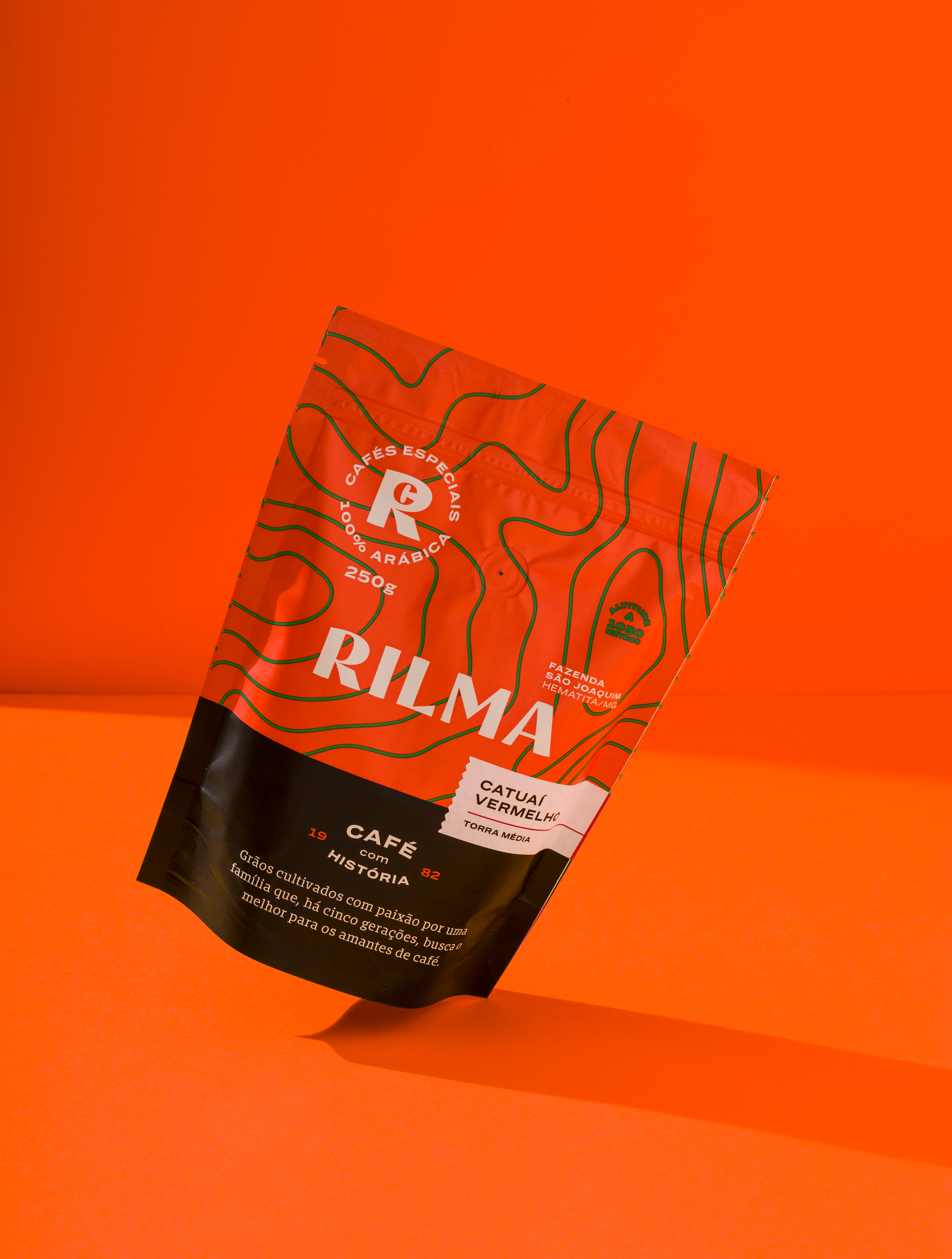
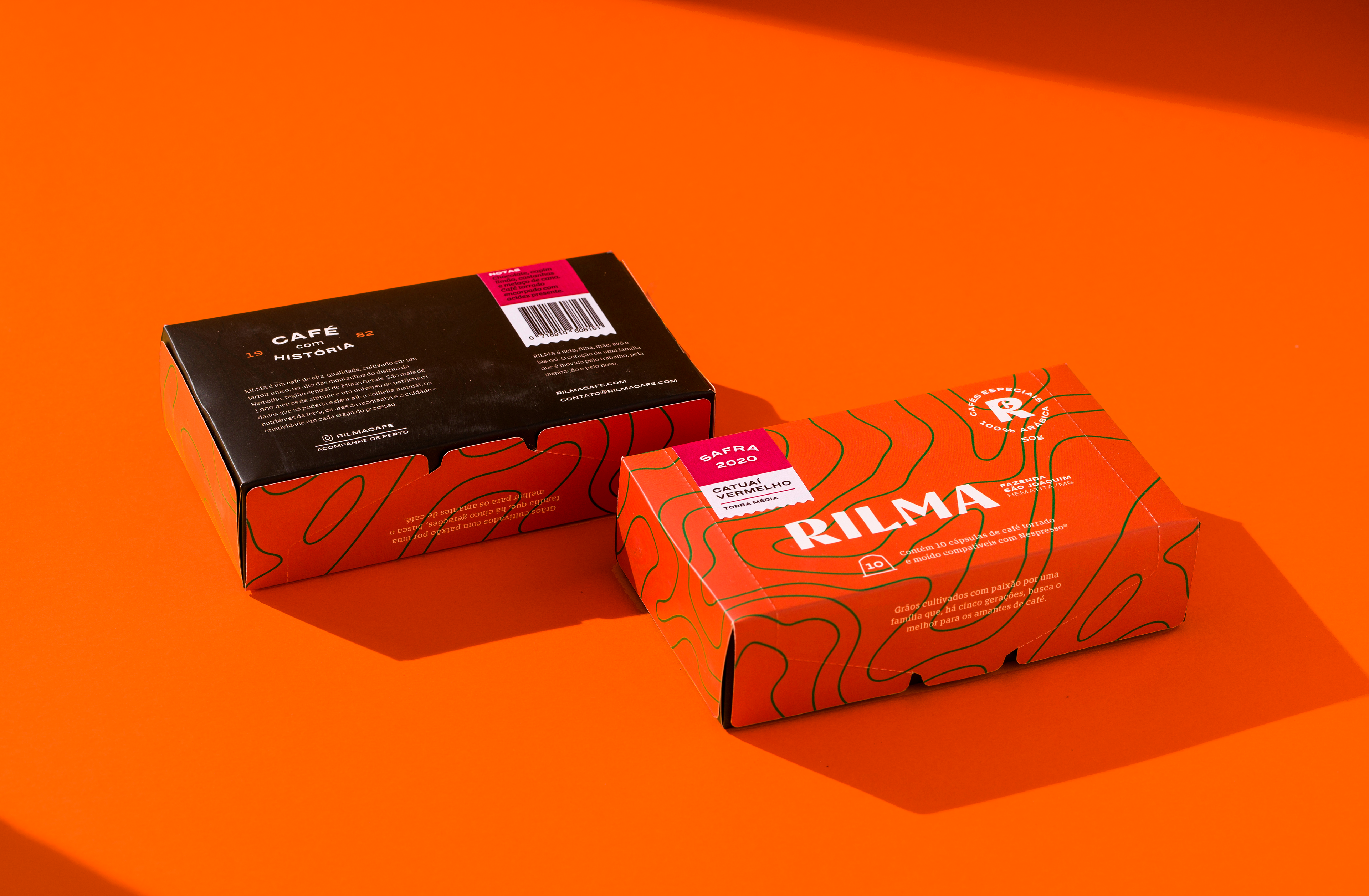
RILMA é um café de alta qualidade, cultivado em um terroir único, no alto das montanhas do distrito de Hematita, região central de Minas Gerais. São mais de 1.000 metros de altitude e um universo de particularidades que só poderia existir ali: a colheita manual, os nutrientes da terra, os ares da montanha e o cuidado e criatividade em cada etapa do processo.
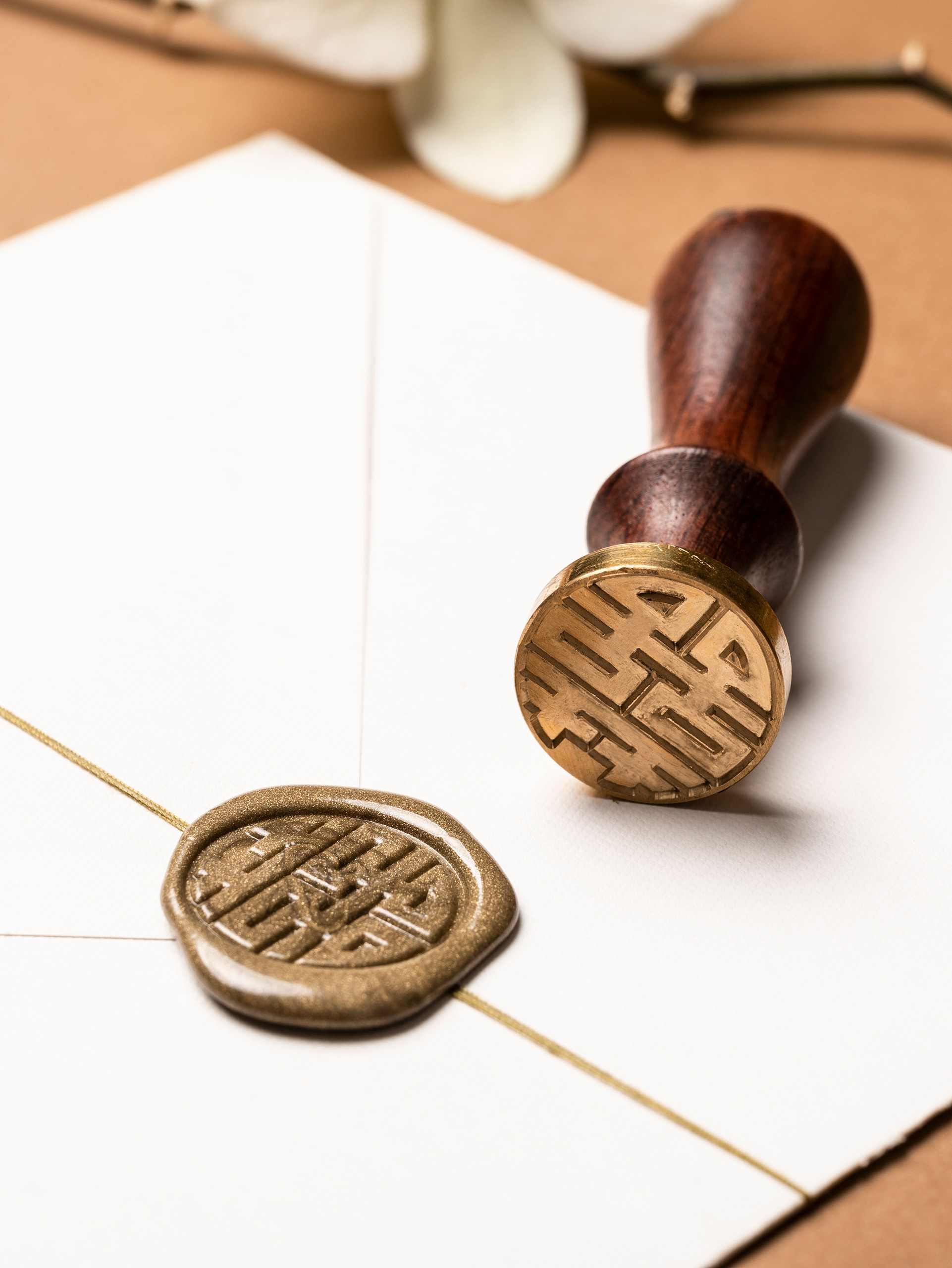
RILMA é neta, filha, mãe, avó e bisavó.
O coração de uma família que é movida pelo trabalho, pela inspiração e pelo novo.
O coração de uma família que é movida pelo trabalho, pela inspiração e pelo novo.
Beans grown with passion by a family that, for five generations, has pursued the best for coffee lovers.
RILMA is a high-quality coffee grown in a unique terroir, high in the mountains of the Hematita district, in the heart of Minas Gerais, Brazil. At over 1,000 meters above sea level, it thrives in a place like no other—where hand-harvesting, nutrient-rich soil, mountain air, and meticulous care infuse each step of the process with purpose and creativity.
RILMA is granddaughter, daughter, mother, grandmother, and great-grandmother. The heart of a family driven by work, inspiration, and a passion for what’s to come.
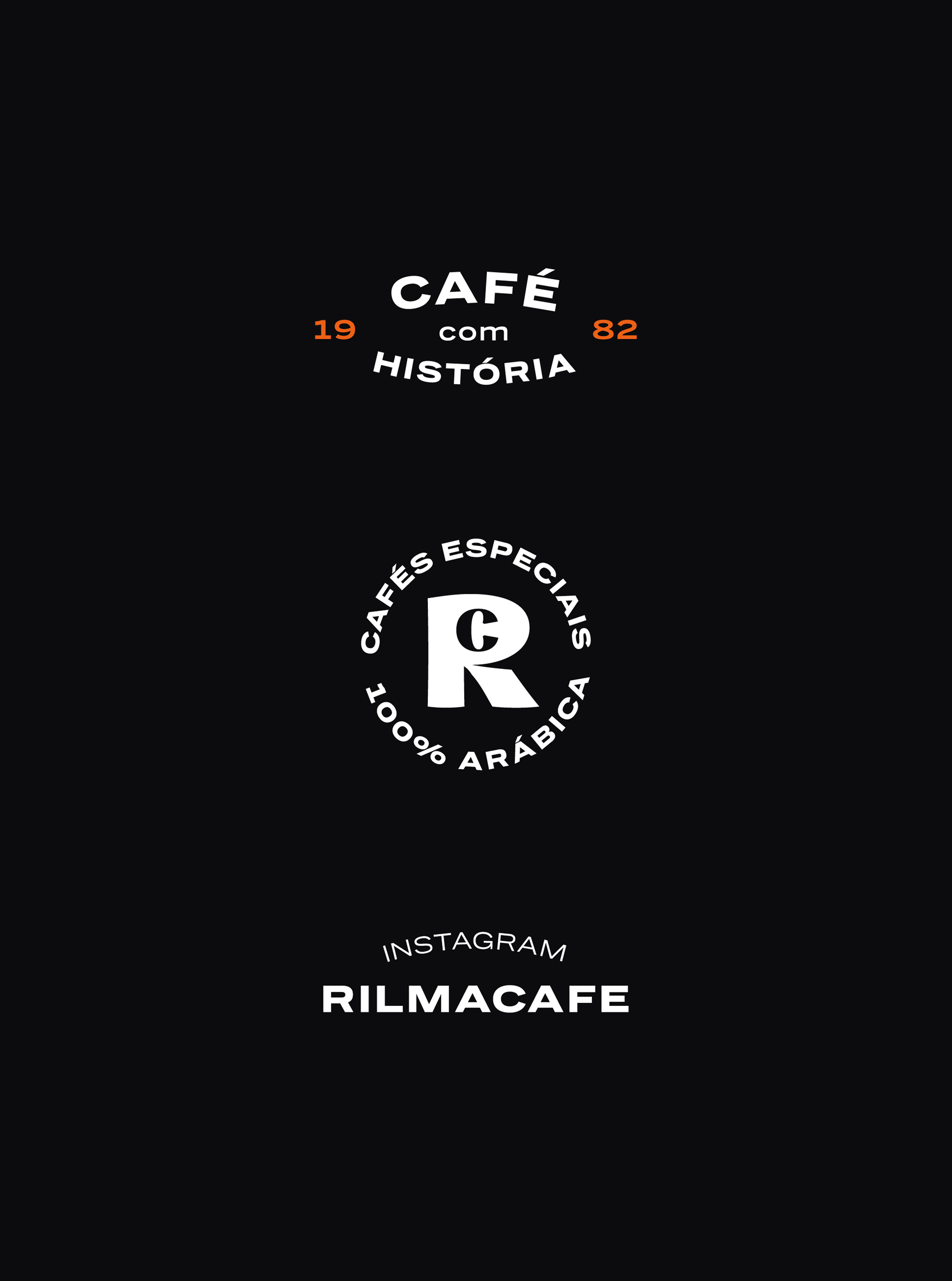
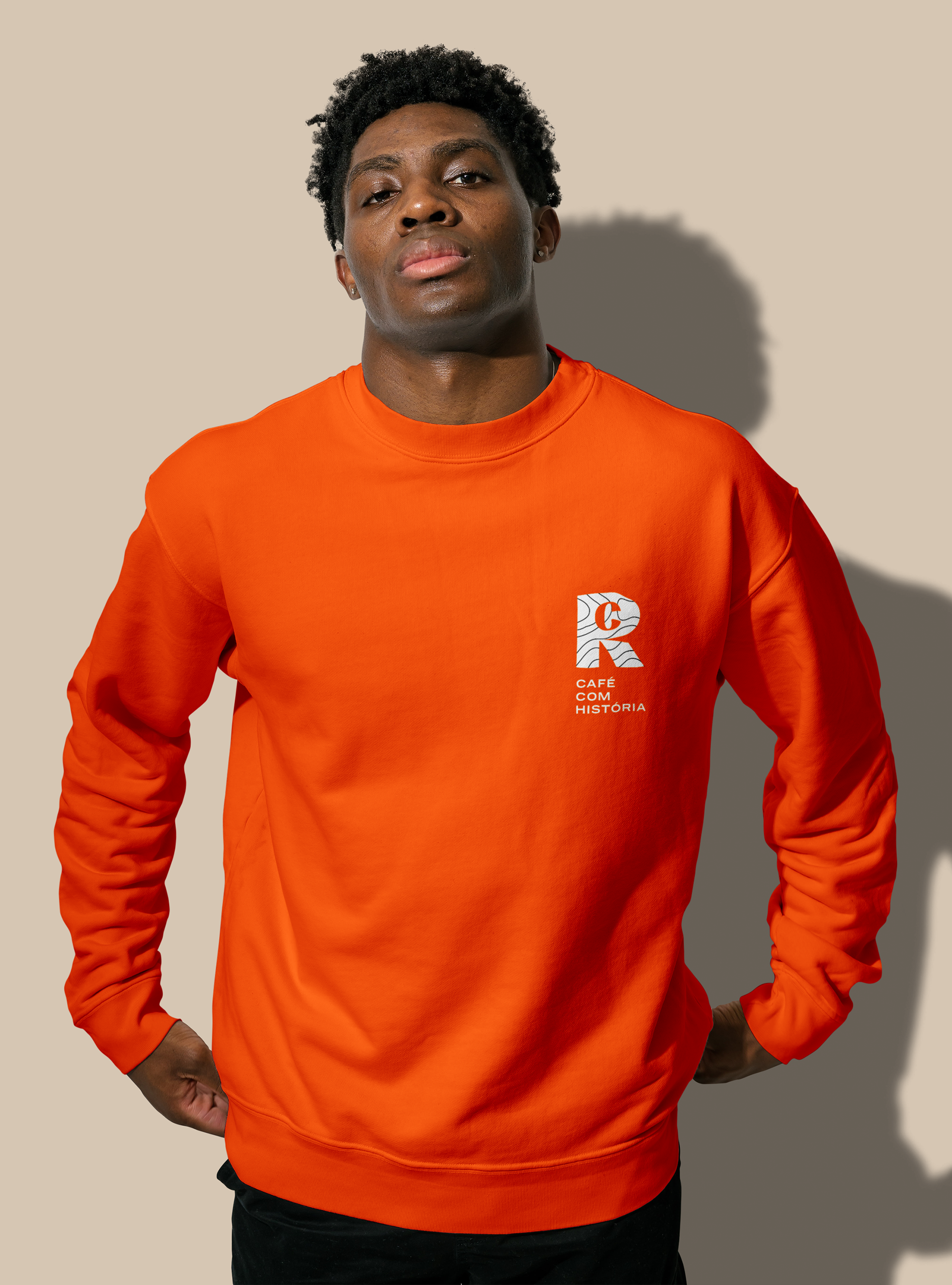
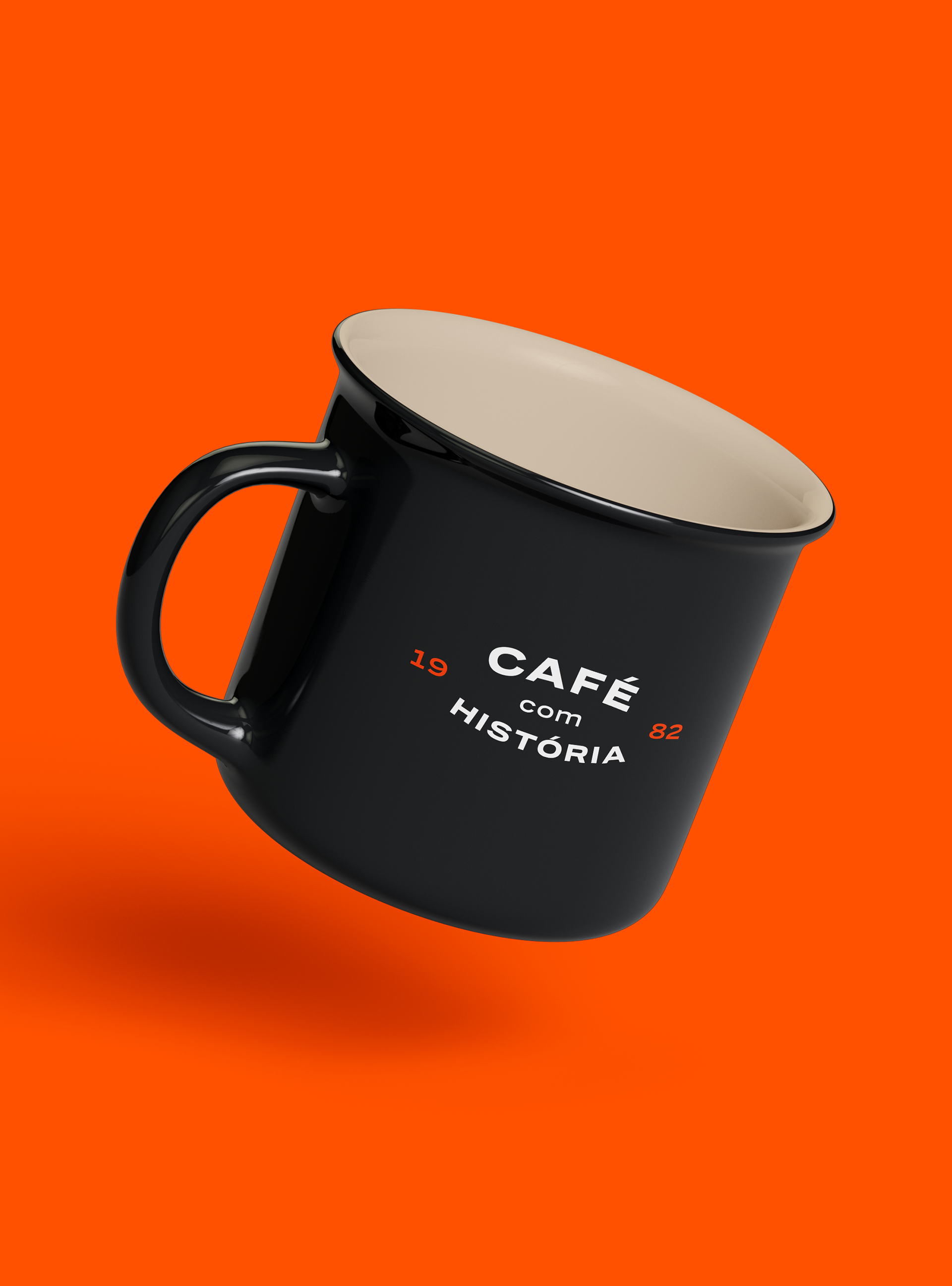
O desafio era comunicar a história por trás da marca: o envolvimento da família, a homenagem a Rilma e tudo o que foi construído ao longo de cinco gerações. Ao mesmo tempo, era essencial destacar o terroir único da fazenda e suas particularidades. Tudo isso foi traduzido em uma identidade que equilibra tradição e inovação — refletindo a alma inventiva da família em cada detalhe.
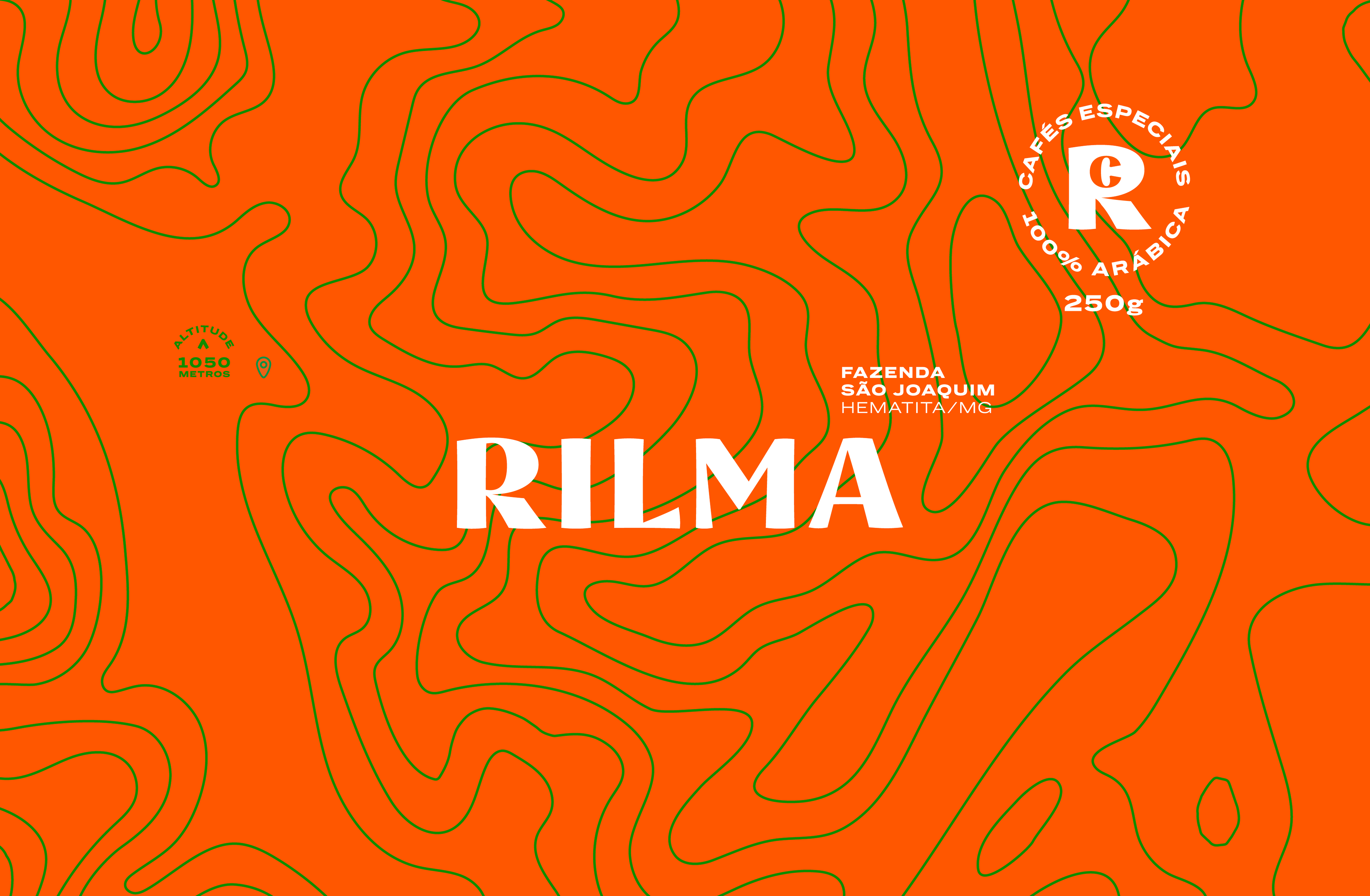
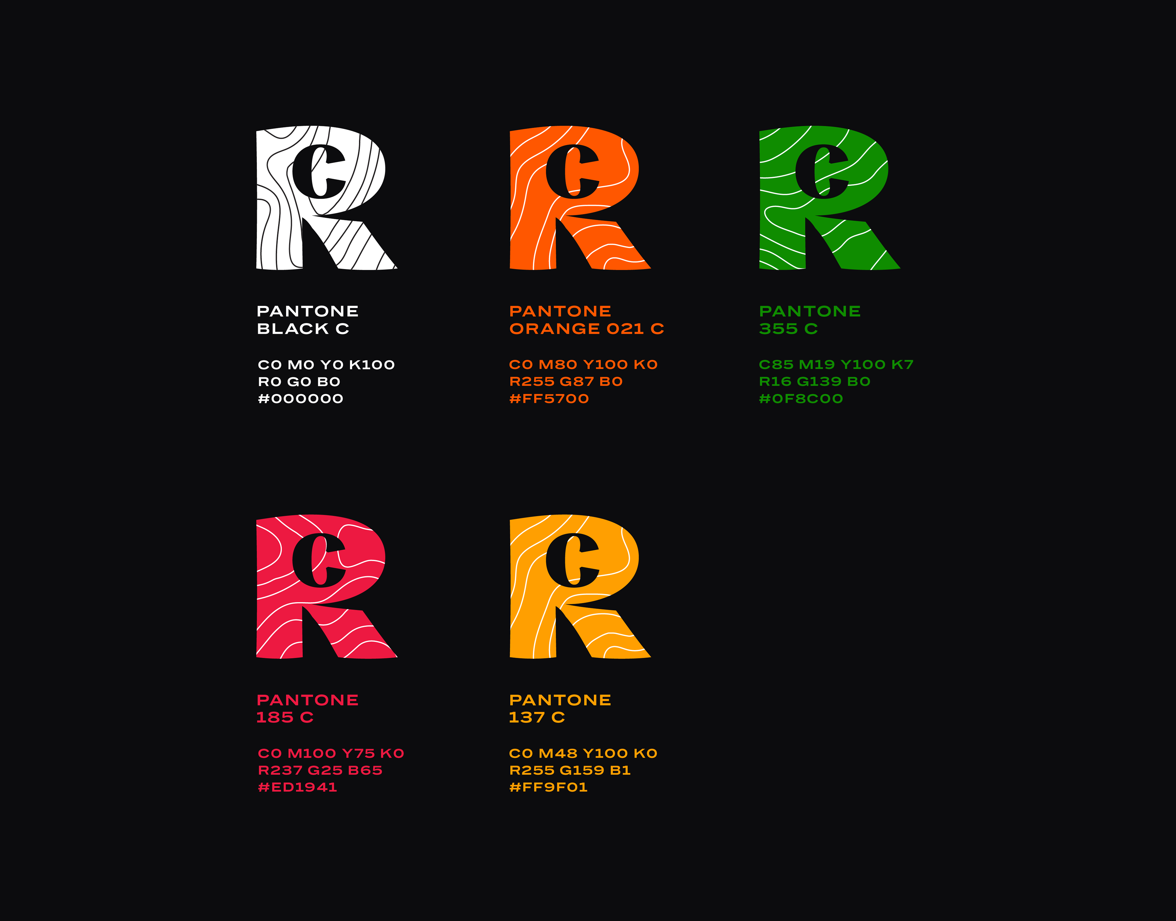
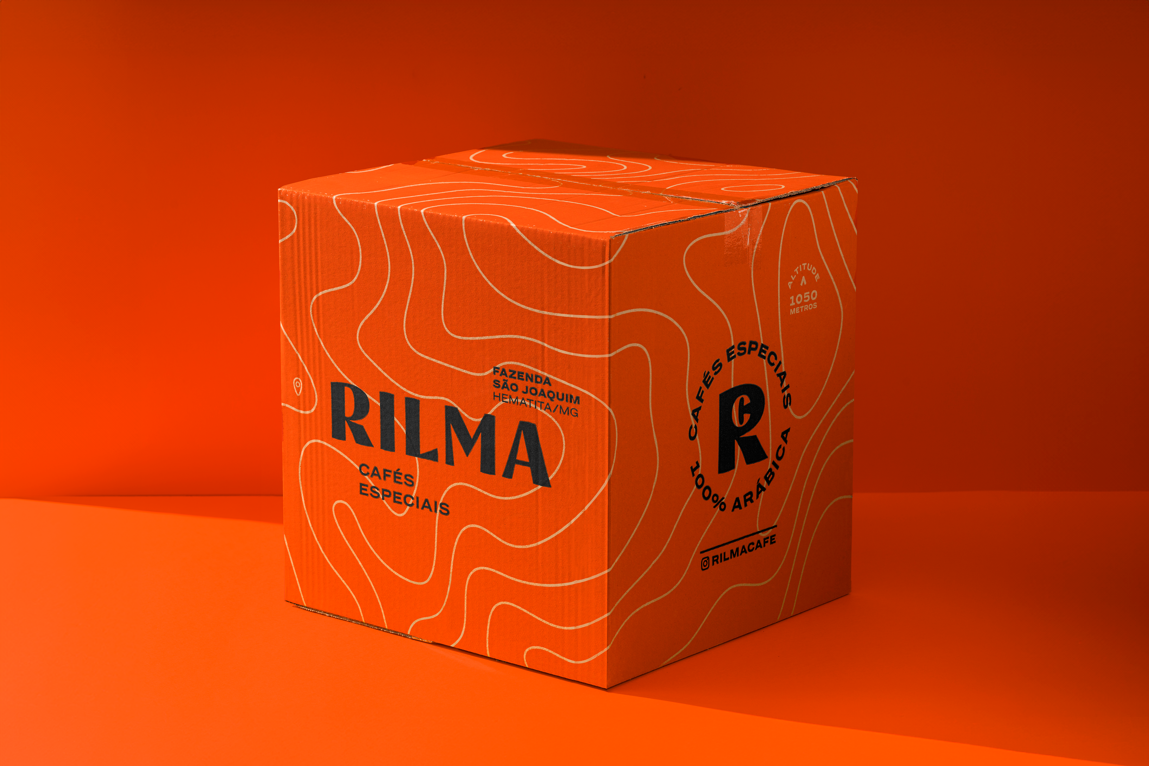
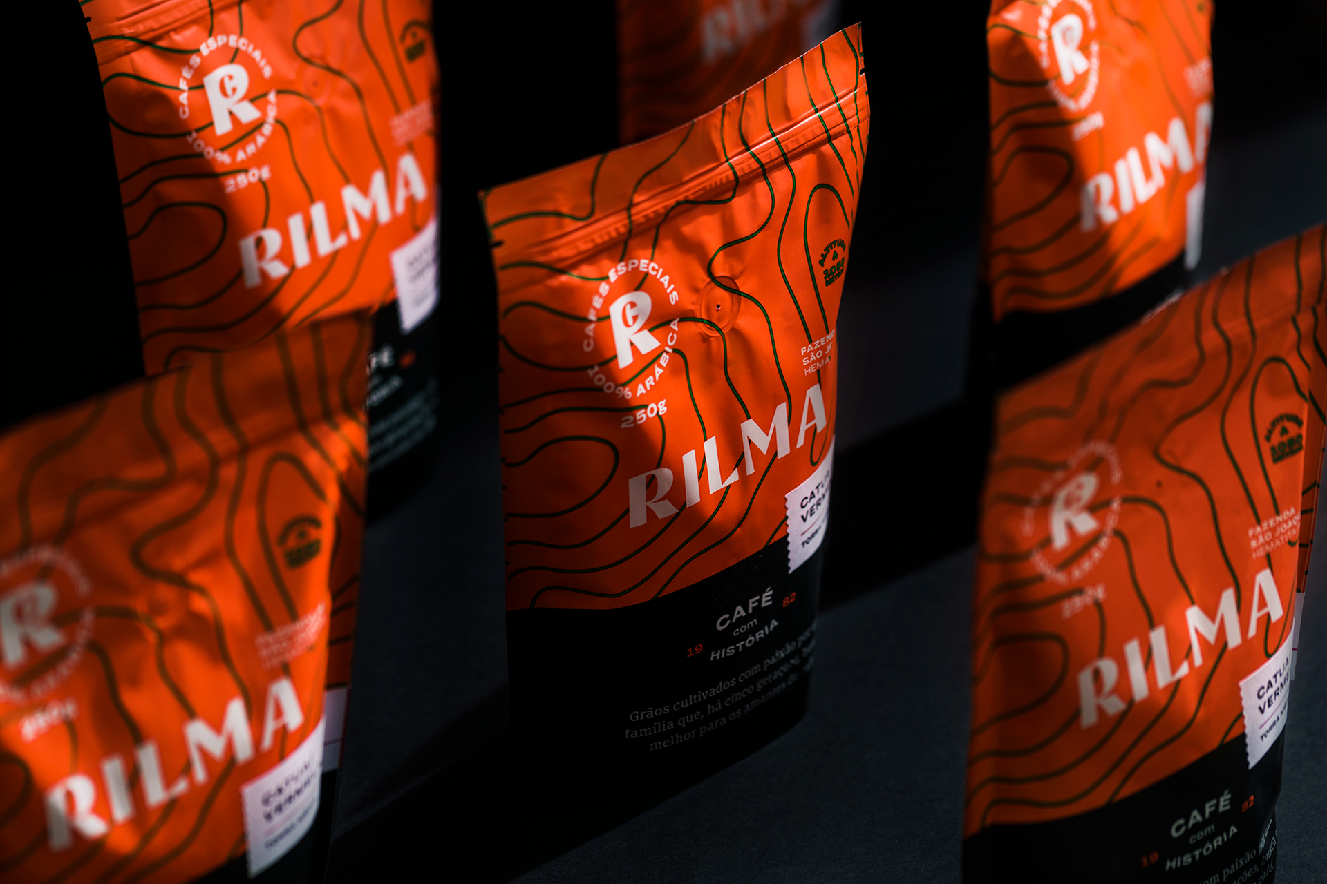
A nova estampa foi inspirada nos desenhos dos mapas topográficos da própria fazenda, resultando em uma linguagem visual fluida e contemporânea. As cores vibrantes — laranja, verde e preto — sinalizam um novo posicionamento, afastando-se da estética rústica anterior e trazendo uma abordagem mais moderna e autoral.
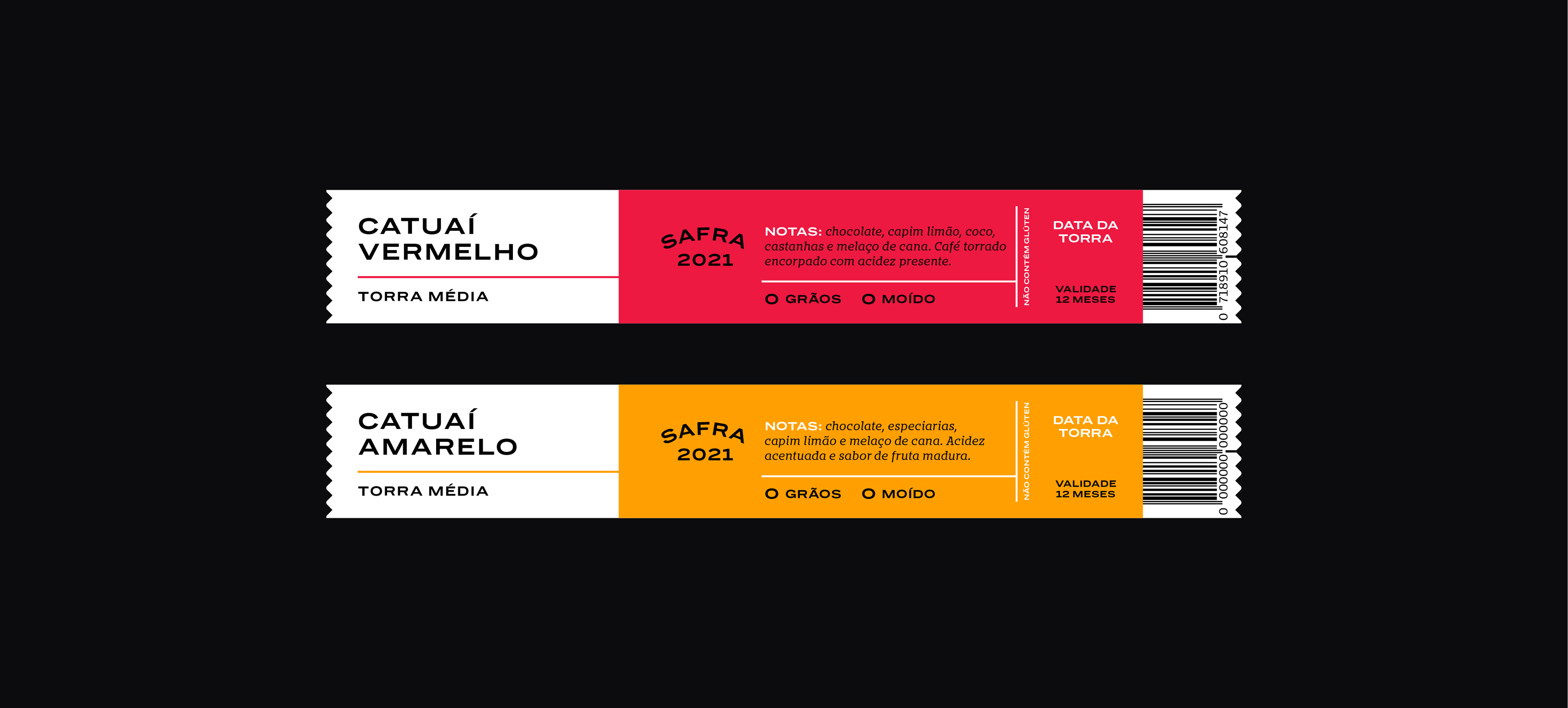
O sistema de embalagens foi pensado para ser funcional e versátil: uma base única recebe um adesivo com as informações específicas de cada café, garantindo agilidade sem perder identidade.
The challenge was to communicate the story behind the brand — the family's involvement, the tribute to Rilma, and everything that has been built over five generations. At the same time, it was essential to highlight the farm’s unique terroir and its specific characteristics. All of this was translated into a visual identity that balances tradition and innovation, reflecting the family’s inventive spirit in every detail.
The new pattern was inspired by topographic maps of the farm itself, resulting in a fluid and contemporary visual language. The vibrant color palette — orange, green, and black — signals a bold new positioning, moving away from the rustic aesthetic of the previous packaging and embracing a more modern, authorial approach.
The packaging system was designed to be both functional and versatile: a single base is paired with a label that features the specific characteristics of each coffee, ensuring efficiency without losing visual identity.
EQUIPE (team) . ESTÚDIO BOGOTÁ
Direção de Criação (Creative Direction): Paula Cotta / Renata Polastri;
Design Gráfico (Graphic Design): Paula Cotta;
Direção de Criação (Creative Direction): Paula Cotta / Renata Polastri;
Design Gráfico (Graphic Design): Paula Cotta;
Redação (Text): Marcela Dantés
Fotografia (Photography): Rafael Motta